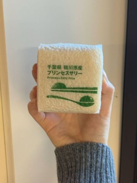
Princess Sally Rice
Rice product likely intended for cooking and consumption.
Country of Origin
Japan
Typography
The typography is clean and modern, featuring a sans-serif font in a vivid green color. The choice of sans-serif suggests a contemporary brand identity, while the clear spacing and alignment enhance readability. The Japanese characters above the English text provide a harmonious blend of cultural elements.
Packaging
The packaging is compact and square, with a textured surface that resembles cloth or paper. It uses a minimalist design with green text and graphics against a white background, enhancing simplicity and elegance.
Facts
- Originates from Chiba Prefecture.
- Features a minimal and clean graphic design.
- Emphasizes a traditional and natural aesthetic.