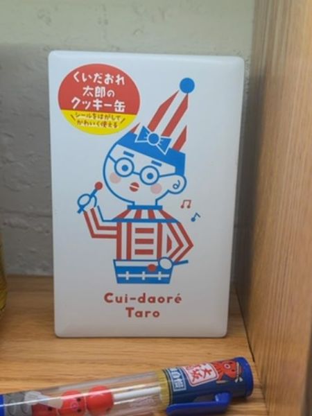
Cui-daoré Taro
A packaged product featuring a playful design, often associated with confectionery or snacks.
Country of Origin
Japan
Typography
The typography uses a clean, sans-serif font that conveys a modern and playful vibe. The text is bold, making it easily readable and complementing the bright colors of the illustration. The use of lowercase letters adds an informal and friendly tone to the packaging.
Packaging
The packaging features a whimsical illustration of a character in a colorful outfit with bold red and blue tones. The design is eye-catching and uses a minimalistic approach with a cartoonish style to appeal to younger audiences.
Facts
- Cui-daoré Taro is a well-known mascot from Osaka, Japan.
- The character is often used to represent various local snacks and products.
- Cui-daoré Taro is associated with the historic 'Cui-daoré' building in Osaka.