独身打破
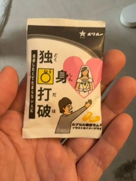
A novelty product, possibly intended as a humorous gift, suggested to improve romantic relationships.
Country of Origin
Japan
Typography
The typography uses bold, sans-serif characters for the main product name to ensure readability and impact. The choice of font maintains a traditional aesthetic, aligning with common styles found in East Asian packaging. Accent characters offer a modern touch with elements of simplicity and minimalism.
Packaging
The packaging features a satirical illustration of a man reaching out towards a bride image, set against a playful heart motif. The overall design uses a mix of vibrant colors to capture attention, complementing the white background.
Facts
- The packaging uses humor to engage potential buyers.
- Illustrations play a key role in conveying the product's message.
- It is a capsule form product.